Deep focus
Sticky hamburger breadcrumbs...
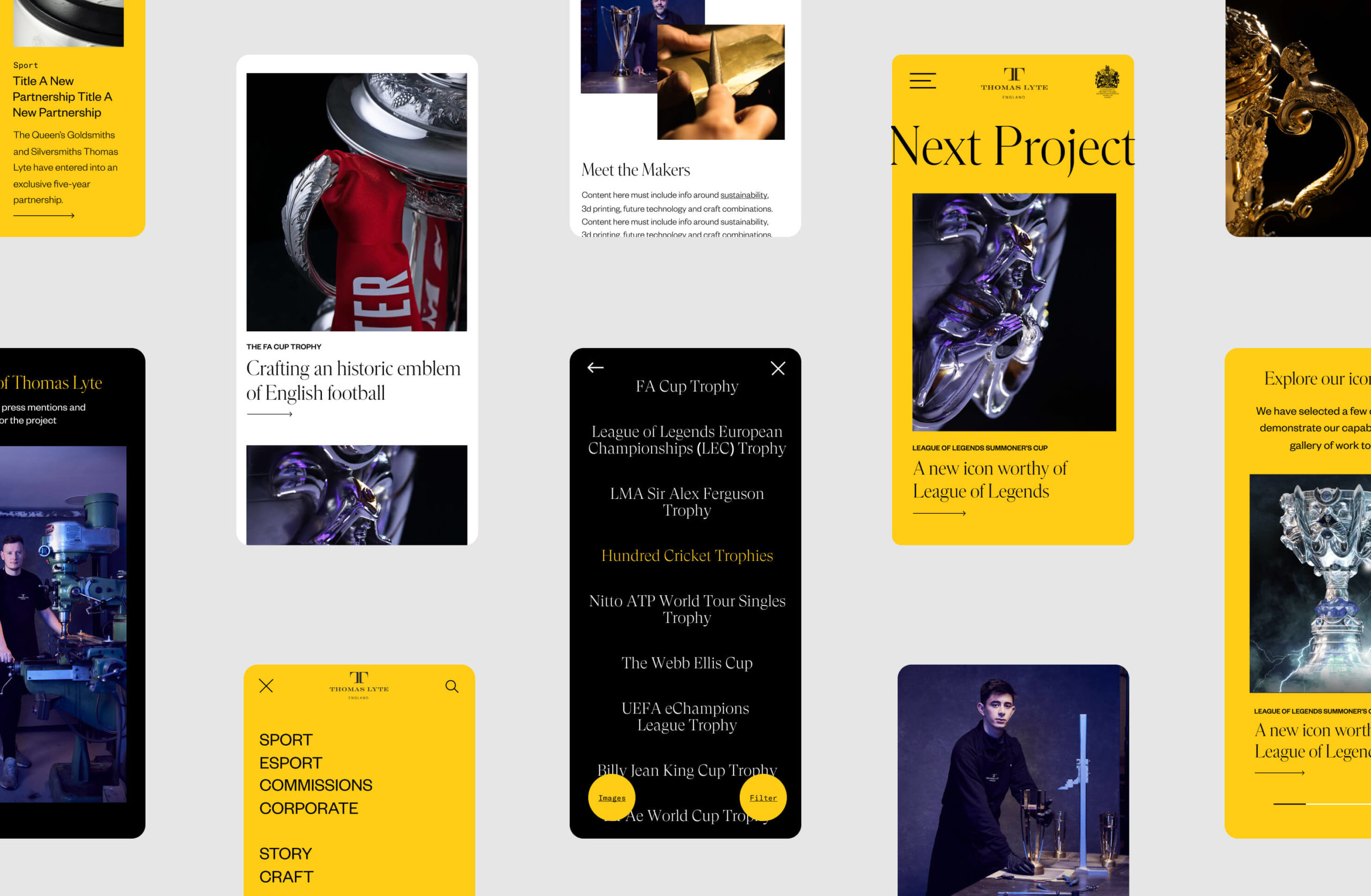
When not to use a Hamburger
Obviously I am talking about website menus. And, the hamburger menu, for anyone not aux fait with the term, has been introduced as a space saver menu on mobile devices. It’s normally used top right or top left of the mobile header although recently we have been trying to put more at the bottom, as phones get bigger, your thumb can’t stretch!
There are two reasons why a hamburger menu has been adopted to desktop; it allows for more or bigger imagery immediately without the worry of legibility / clutter of a menu or too many items have been put into the primary navigation and the hamburger menu allows things to be hidden away and cleaner.
Both of these reasons make sense but are ‘lazy’ and have not considered the user experience, rather following their (the content manager’s) own needs. This is common with many websites as they live on after launch. If you have a website with only a few pages then this article isn’t relevant for these points.
Users need to immediately see what is included into the website via the primary menu, and a hamburger forces more clicks or more scrolls. Bad UX.
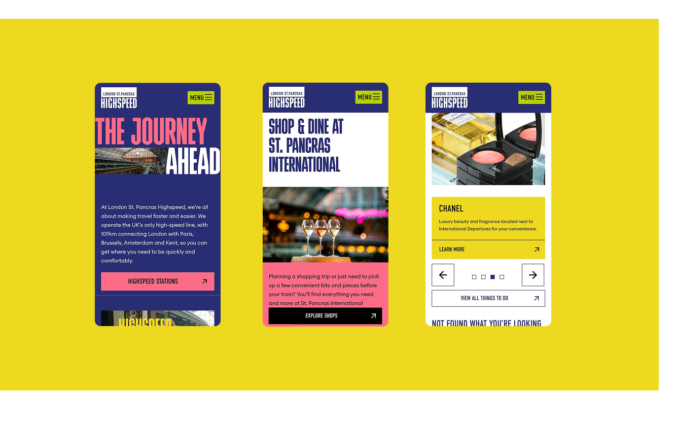
To work with a better UX we can look at creating more thought around user actions, which will be decided using your statistics on page depth, page visits etc. First, we need to think about what needs to go into the primary navigation – the top level. Ideally this should be no more than 7-8 key directional pieces of content. Content that needs to be reached quickly, is familiar to the user and acts as a flag post.
We can remove logins, accounts, contact tabs and “home” (yes, people still try and add a home button!), and put these into an information bar which is familiar to user patterns. This frees up some space. Then, we look at what is important to the client vs what is important to the user. Users rarely click on ‘news or blog’, and even more rarely click on about us (unless they are making sure they are a real company). This content is important to back up other content but can be navigated to via the footer, quicklinks throughout the page or a deeper navigation.
Try to focus on 7 items that are really important, and clear for people to get to their desired content quickly. The introduction of the mega navigation gives a lot more space to educate the user on what is within these sections without having to click on the page. At this point we can almost give a contents list of what the section contains, and also persuade with other elements of visual and verbal content. Finally, if the website has a lot of pages, product or complex information introduce intuitive searches with FAQs to guide those lost in the process.
Remember to design for the audience.
Talk to us about digital strategy, creation of user personas and structural wireframes to help determine the best flow.