Press Release
Deep refresh an award-winning global social business, SATO, with a new brand identity
Independent creative design agency Deep has created a refreshed brand for SATO, a global sanitation and hygiene company positively impacting the lives of millions across the world.
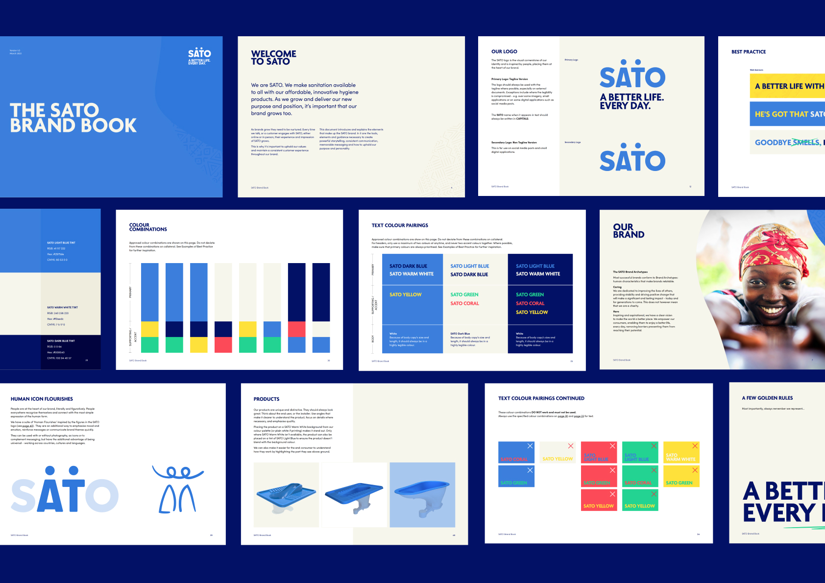
The new brand positions SATO, part of LIXIL, as a leading provider of affordable solutions for sanitation and hygiene products, offering innovative toilets solutions and taps for consumers who don’t have access to sewage systems and have limited access to running water. The rebrand was tasked with making SATO aspirational to consumers in Africa and Asia in order to improve their lives every day and empower their futures.
Janaína Campoy, Global Marketing and Communications at SATO, part of LIXIL, commented: “As an ambitious brand on a mission to improve lives around the world, our brand is a strategic asset and one that needs to connect deeply with our global and local audiences to drive behaviour change and product adoption. This was not an easy project
due to the cultural diversity of our audiences, but working as a part of a team with Deep, we were able to deliver a refreshed brand identity that injected new energy internally and externally and one that is already showing strong results.”
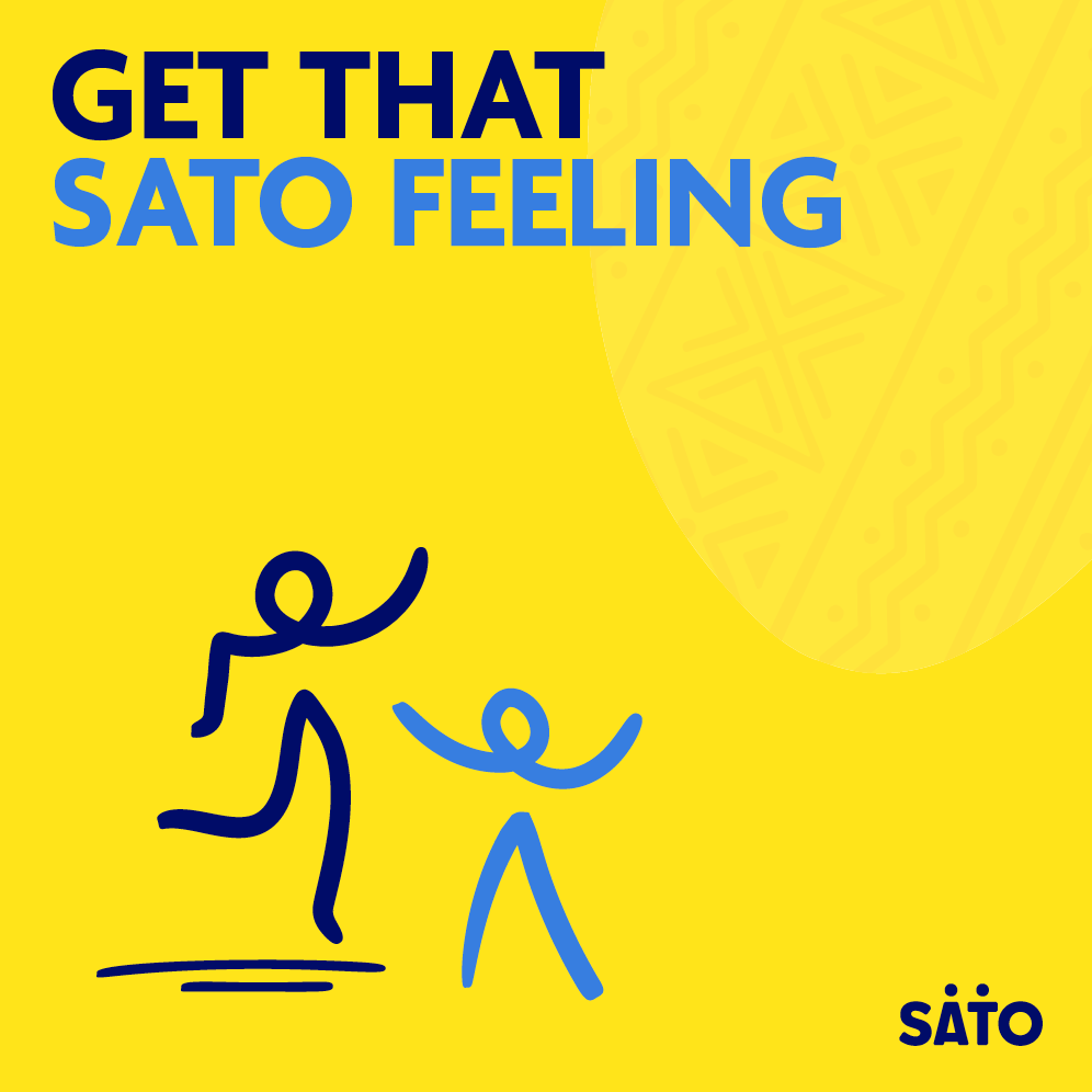
The challenge of creating desire around SATO products was combated with a cohesive brand that communicates the product benefits, with a goal of creating bold, impactful and simple look and feel and messaging to resonate with diverse audiences across different countries and languages. To increase a sense of aspiration for users around SATO products,
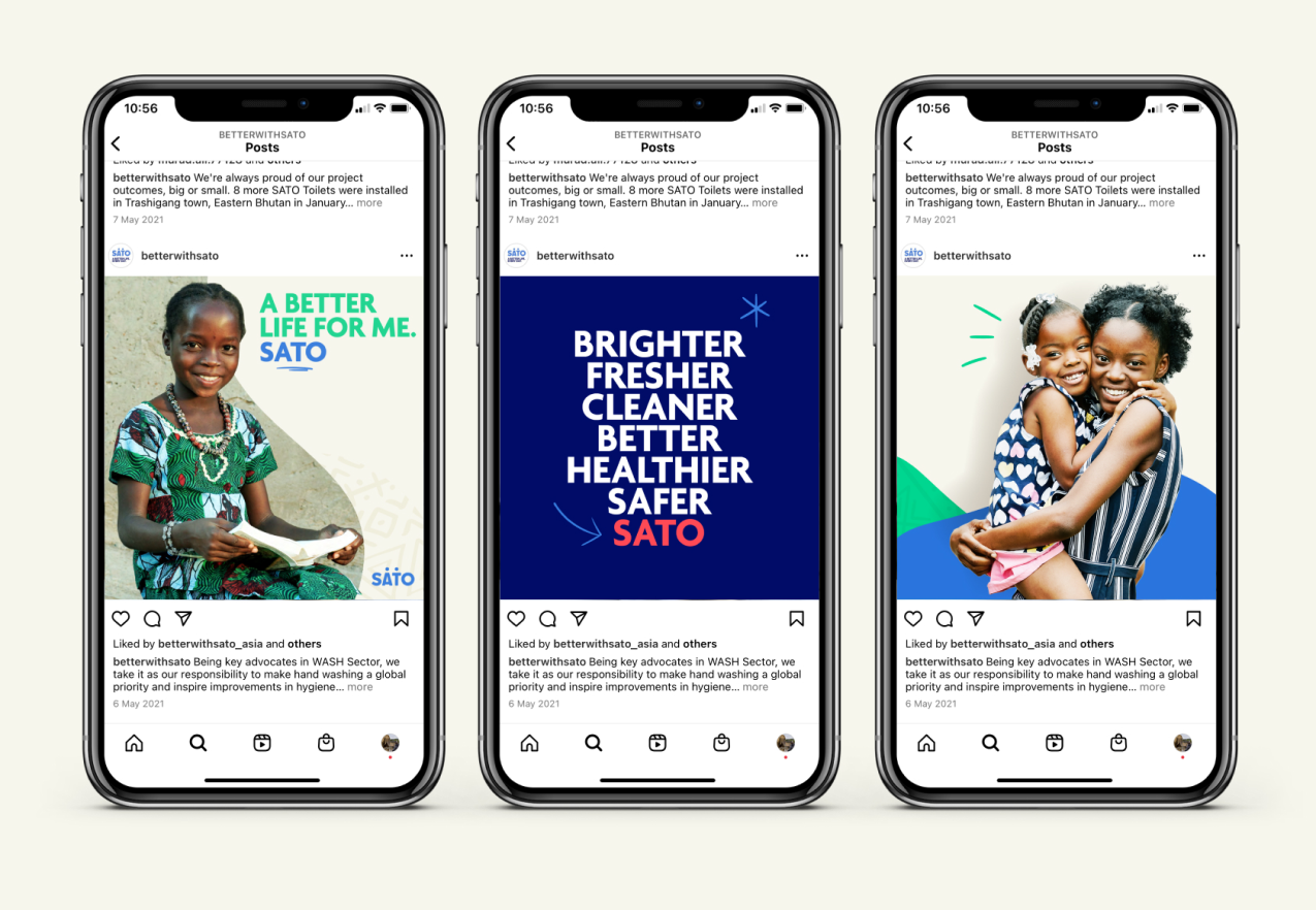
Deep focused on what the products and solutions allow end users to do and achieve — such as enabling children to go to school, women to learn and work, and communities to come together in a way that might not have been possible without access to safe sanitation and hygiene.
SATO and their innovative sanitation and hygiene solutions equally needed a customer-centric rebrand to help distinguish themselves as a commercial business. Introducing a more vibrant palette, a suite of emotive flourishes and patterns inspired by local cultures, the refreshed brand surpasses language barriers and connects emotionally with SATO’s audiences. Through working globally with the SATO team across several territories, Deep were able to glean key insights around the differences in end users from region to region to shape how the brand could roll out practically and effectively.
Using patterns and imagery inspired by the different territories, the brand can be flexed within local communities in a way that doesn’t compromise on the overall brand look. Emotive flourishes and human figures help communicate in a pictorial way, ensuring the brand can work in any community setting to show the benefits of sanitation aren’t just technical ones.
Amy Vickers, Designer at Deep commented: “Working in partnership with Marketing teams in Asia and Africa helped to create an exciting brand that truly connected with audiences locally – with an energetic and vibrant overarching global brand and its localised nuances – to show the immediate and long term benefits of improved sanitation and hygiene.”
Since the rebrand SATO has seen employee engagement on social media increase by 50%
and website enquiries triple, a mighty result for the company who are looking to improve 100 million lives by 2025 with their solutions.